Who ate all the pies?
A couple of US websites have nominated the graphic below as the worst of the year. While this is a hotly-contested title, I think they may be right.
It comes from the US Environmental Law Institute, a Washington-based policy and research centre focussing on the use of the law to improve the planet. The graphic purports to illustrate the fact that the US Government has subsidised environmentally-unfriendly fossil fuels more generously than renewables.
The institute concludes: “These figures raise the question of whether scarce government funds might be better allocated to move the US towards a low-carbon economy”.
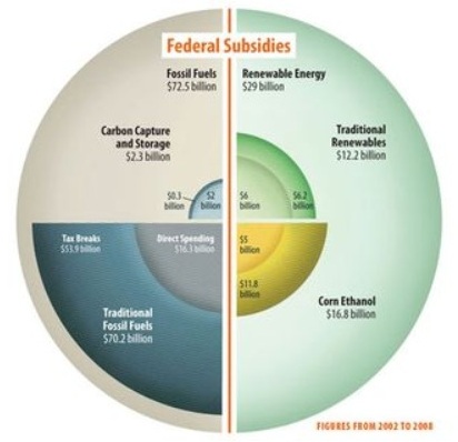
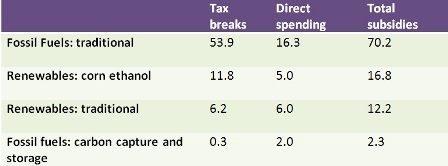
A fair question, but not one the graphic makes it any easier to understand. It’s a pie-chart, but not any recognisable kind of pie. As Kaiser Fung of the Junk Charts website points out, the actual data consists of just 12 numbers, which can be far better understood as a simple table.
Curiously, when I searched for the original of the graphic, I found a different version on the institute’s website. The data is the same, but the graphic (below) has been changed in ways that don’t actually make it any more comprehensible. It looks less like a pie-chart, but if you aren’t creating a pie chart there’s no sense in arranging the data in quadrants this way, and certainly not in equal-sized quadrants.
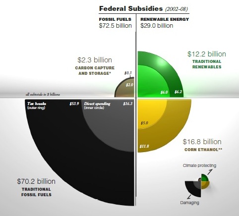
For connoisseurs of bad graphics, or graphic artists in search of tips on how not to do it, Mr Fung’s website is worth watching.
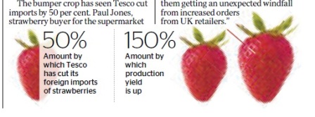
Finally, here’s a graphic I spotted in The Times on Monday. It illustrated a story about how the benign weather had boosted the production of English strawberries by 150 per cent, enabling Tesco to cut imports by 50 per cent. How much information or understanding does this graphic add to the story? Not a lot, I’d say. But at least it wasn’t a pie chart.

Anonymous (not verified) wrote,
Tue, 19/07/2011 - 01:46
Even presented as a simple table the numbers are useless or misleading. The comparison should be between government subsidies PER EQUIVALENT amount of energy. ie, how much does a gallon of gasoline (or a kilowatt or energy) generated with traditional fossil fuels cost, and how much of that is subsidized by the government VS, how much does a gallon of gasoline (or a kilowatt of energy) from renewables cost to generate, and how much of that cost is subsidized by the government.